
I first learned about what value is when I started a quilting a couple years ago. My mom's a painter and she's tried to explain to me the importance of value, both in my quilts and in her paintings. Mostly I understood what she was saying but couldn't really implement the concept myself. I will see it when I have a quilt that looks amazing, and then my next one is very eh. I step back and think what went wrong. That's when someone points out that I've used all the same value and thus lost some of the pop and interest. That's when I can see it. So when I try and plan ahead to use different values I get hung up and my mind starts weaving knots. It disrupts my creative mojo and somehow I end up making something else all in the opposite value.
I stopped reading beading tips, suggestions, and how to's years ago. So maybe there is more material out now but I've not ever read anything about value with beads. But since they are color and come in different shades and lightness I'm thinking all the same rules apply. You want different values in a piece. And apparently if you can create an interesting pattern with the value (which can be the same color) you'll have a masterpiece.
Here are some rules of thumb about value that I found on write design online.
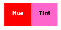
Value refers to the lightness and darkness of a color. For example, if light falls on a green ball the part of the ball nearest the light will be lightest in value because it reflects the most light. The part of the ball opposite the light will be the deepest in the shadow and thus darkest in value.Remember - you can also change the value of a color by adding black (shade), or white (tint), or gray (tone). As white is added to a color it becomes "higher" in value (lighter). As black is added it becomes "lower" in value (darker).Use values that are close together to give the design a calm appearance.Use values of pure hues as well as those of tints and shades to create movement.Use value contrasts to show texture and as an effective means of directing viewer attention in a composition.Remember that value is the relationship of light to dark.
Katya - Katya 3 - 2002- Based on color theory of Josef Albers

I haven't gotten far enough into my color theory education or even experimentation to attempt to photograph the pictures of loose beads and finished flowers to try and figure this all out. And better yet explain it. It would be giant undertaking considering not only do beads have lots of colors, shades, and brightnesses, but each one can have a different finish. Such as silverlined beads, a pearl finish, A/B finish, this all adds dimension and changes the value. Even the type of wire or thread used will change the color.
All these thoughts popped into my head after I showed Mom my semi finished strawberry wreath. I was kinda eh on it...which felt weird because I've been excited about it for weeks. She pointed out that the red strawberries were probably the same value as the grapevine branches. Which makes them not the first things you see. But they are the main deal so I'm in fix it mode. Fix it mode turned into think on it mode. So I picked up beads and started a new flower which now that I'm looking at it, it is also all the same value. So I came here to try and figure out my love/hate relationship with value. Then maybe back down to my table to try some different thoughts.
Does anyone else have struggles with value? does it take a degree to finally understand it? Or is it just one of those things that's worth the struggle?
3 comments:
I have been trying to understand value for a while as well. I had never heard about those differences between shade, tint and tone as far as I can remember. Being not a native English speaker, I thought I could use them interchangeably ...
Great post! Lots to think about.
I find it an ongoing project learning about value. You know it when it works. It's sort of instinctual. Something pops. And it takes having those successes every so often to finally start to see how to get there.
@nordwolke I often use those words sort of interchangably but I do know that there is a difference in meaning when refering to art or to color. The differences aren't really well know none in everyday talk or conversation unless you are an artist or have training. I didn't realize how much there was to know and learn until recently.
@Cathy definitely an ongoing process. I added more light green leaves and that is helping. Needs more though to really make it work. total Tim Gunn moment there. =)
Post a Comment